Start from a real job
Imagine you are building a small game and need a chunky 8-bit UI font for SCORE, PLAY and GAME OVER. Say what the font is for and how the letters should look. Clear use cases make the first version easier to judge—and easier to edit later.
Create the first version
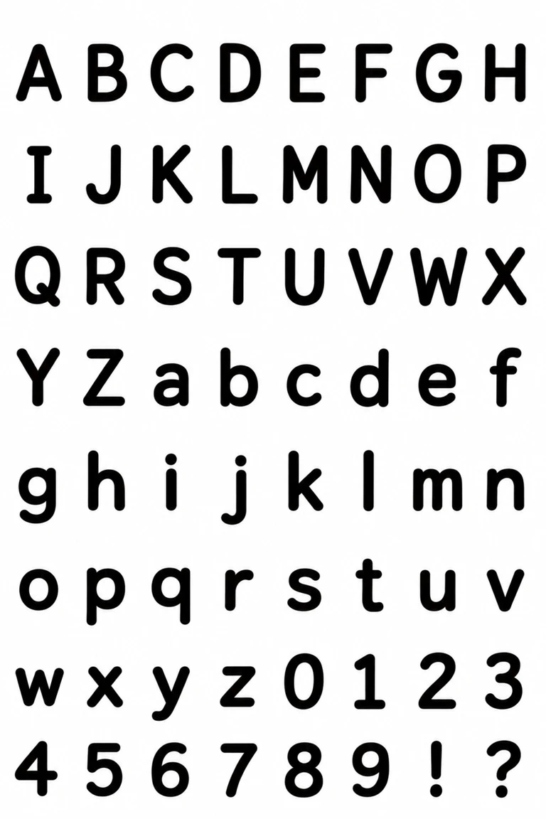
Open Style fonts, keep Input type on Description, choose your font language, and describe a bold pixel HUD font. Name the blocky look and ask for capitals and digits to share a height, with short lowercase letters on one x-height. Check the credit cost, then click Create font. Wait for the first version before editing.
Try the words you will actually use
On the finished font page, type SCORE 0123456789, PLAY START · LEVEL 01, and GAME OVER. At the size you need, check whether letters and digits sit comfortably together and whether the gaps stay clear. Use what you see to choose your edit.
Open Edit font
Click Edit font on the finished font. The version marked In use is selected as the edit base by default. In Font preview, you can choose an earlier version as the base instead. Previous versions stay available for comparison.
Write one clear change
Choose the version you want to edit, then name the characters and the shape change. Here we start from V2 and ask for a small square cut at the outer corners of S, C, O, R, E and 0, 1, 2, 3. Ask to keep their height, width, baseline and stroke thickness, and to leave all other characters unchanged. Check the displayed credit cost and click Generate version.
Compare the changed characters
Review the current and proposed characters side by side. The new corners make the selected letters and digits look more pixelated while their size stays aligned. Choose Use these characters if the result works for your game UI, or Keep current font to leave the font as it is.
What editing is good for
For an appearance edit, name the characters and describe the visible change. Say which proportions or characters should stay the same, then inspect the proposed shapes before applying them. Style fonts follow the overall look of your brief or reference, and individual letter shapes can still differ. If you need your own handwriting shapes kept letter by letter, use a handwriting font instead.
Download your TTF
After applying the edit, the new version appears in Font preview. Type SCORE 0123456789 and your own words, then switch versions to compare. Download the TTF from the font page when you are satisfied. The size and spacing controls on the font page affect only the on-screen tryout.